Effect of Table Rank
Analysis
TLDR
There’s no obvious relationship between rank and draws
End-of-season total draws can be broken up into three ranking groups — but these segments have limited predictive power
Average goals for and Average goals against per league position improves ranking groups predictions
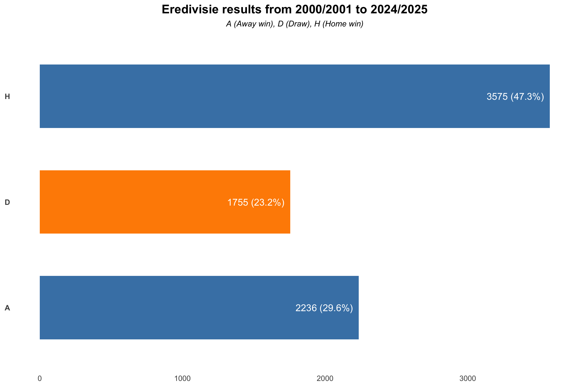
Fun fact: in the past 25 years of Eredivisie, draws occurred in 23.2% of all matches.
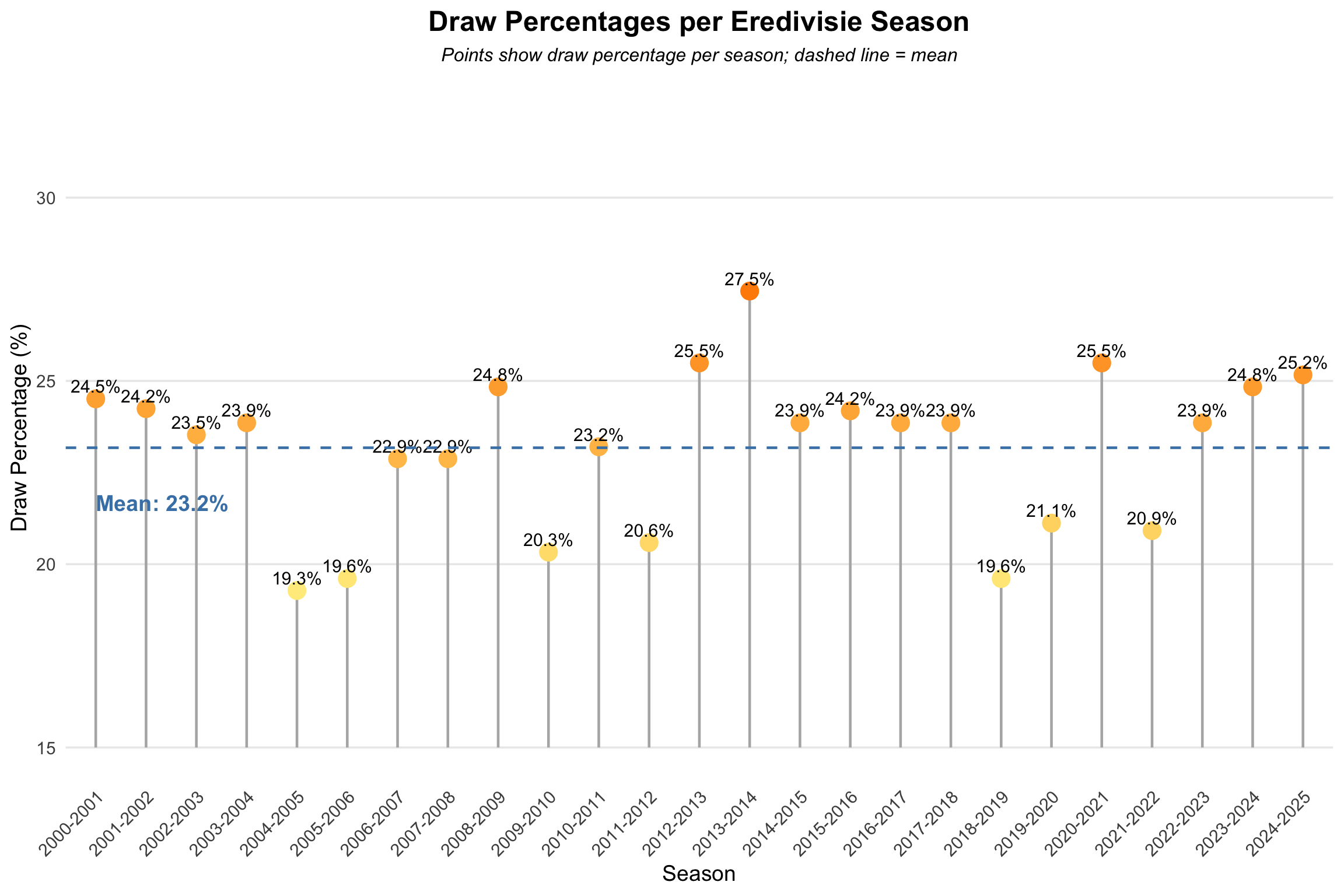
Below I plot that percentage across seasons. This shows a pretty consistent range of draws to expect per season: between 27.5% and 19.3%, with the mean average in the 23%. Every season there are 306 matches played in the Eredivisie, so in absolute numbers I would expect
max 84 draws per Eredivisie season
min 59 draws per Eredivisie season
average mean 70 draws per Eredivisie season
70 draws / 34 rounds ~ 2.1 draws per round per eredivisie season
70 draws / 18 team ~ 3.9 draws per team per Eredivisie season
This last number of 3.9 draws per team per season does not apply to the real world. It’s a simple projection that assumes an equal distribution which by design does not happen in professional competitions. The point of competing is to have winners and losers and therefore this creates an unequal distribution of wins, losses and draws. Winners win more often and losers lose more often and this creates the Eredivisie’s league ranking.
Who does all the drawing? And is there a relationship between league ranking and drawing?
To get a first feel for this, let’s look historically at total draws per league position. The visual below shows:
Final league ranking on Y-axis (position 1-18)
A column per season on the X-axis (2000-2001 to 2024-2025)
Average numbers of draws per league position (e.g. 1st place has an average of 5.9 draws across seasons)
Average numbers of draws per season (e.g. 2000-2001 season has average of 8.3 draws per position)
Each cell contains the number of total draws. The more orange the higher the number
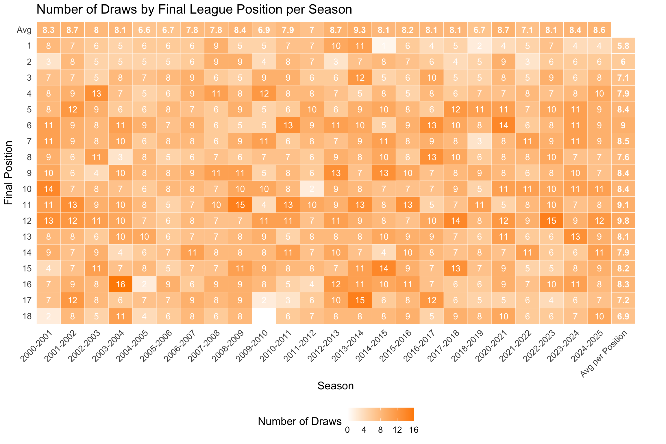
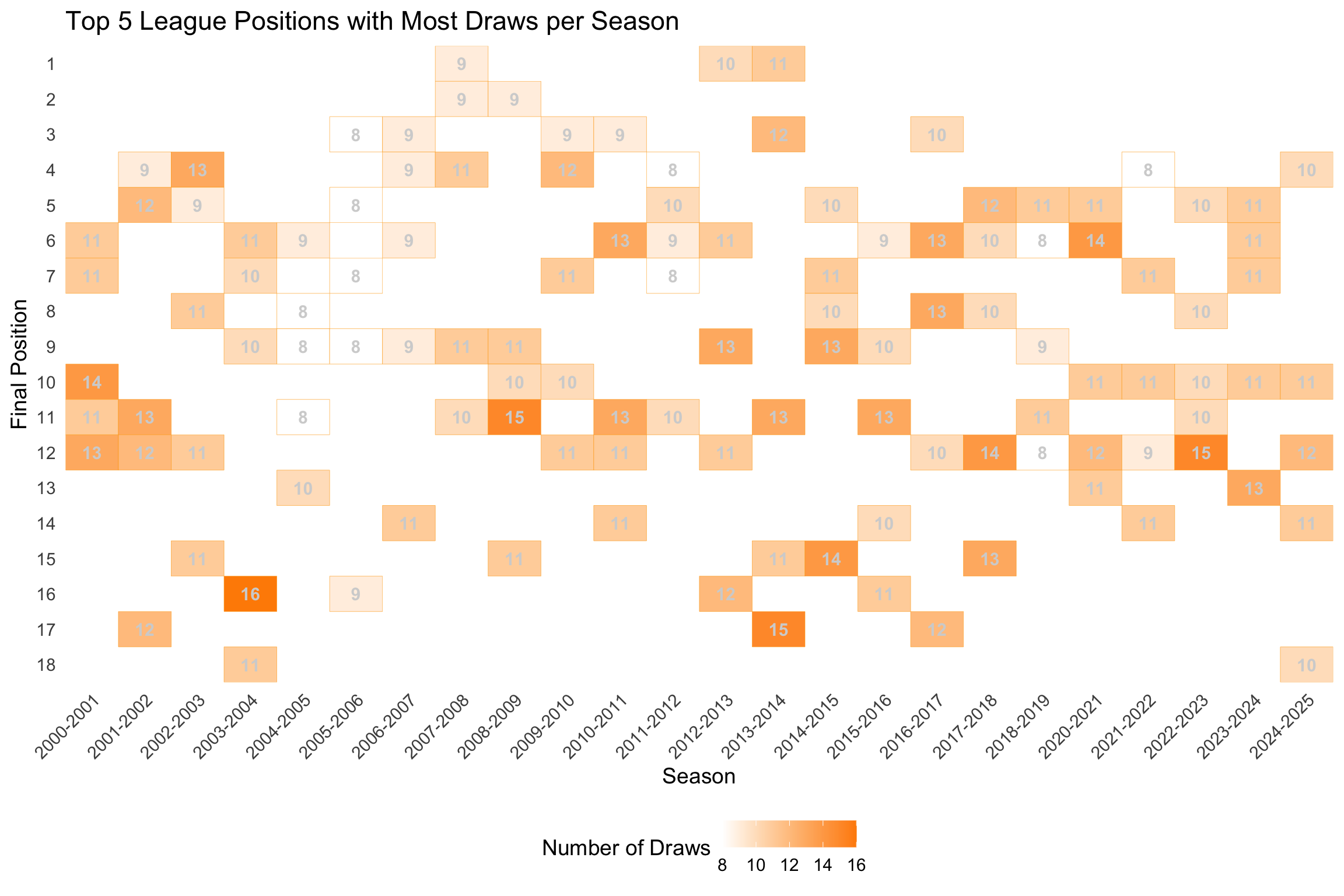
There is a bit too much information in the visual to get a feel for any patterns. So below there’s a simpler version which retains only the top-5 highest number of draws per season. After all, I’m looking for where the most draws happen. Visually I notice only 2 things:
Seems like the action is all over the map – no clear patterns
Perhaps in the seasons since 2018-2019 there’s a bit of a trend toward most draws happening in the middle
So nothing concrete so far in trying to understand the relationship between league position and number of draws per season. Let’s summarize into sets of single numbers. I’ll create the max, min, and mean average per league position. So for example, teams that placed 1st in the past 25 years of the Eredivisie had
a minimum number of draws of 1
a maximum number of draws of 11
an average number of draws of 5.8
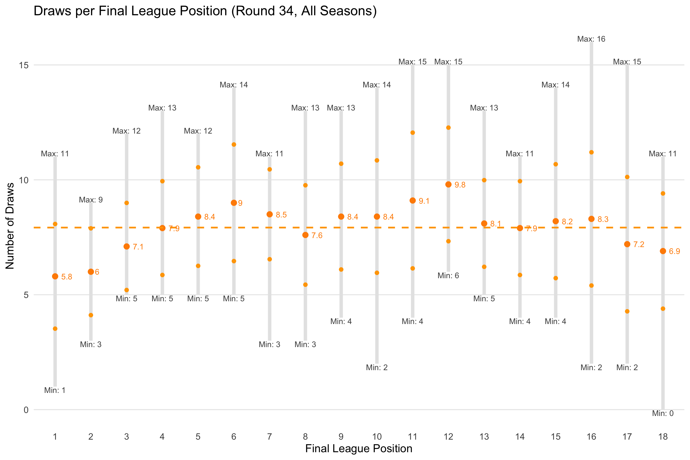
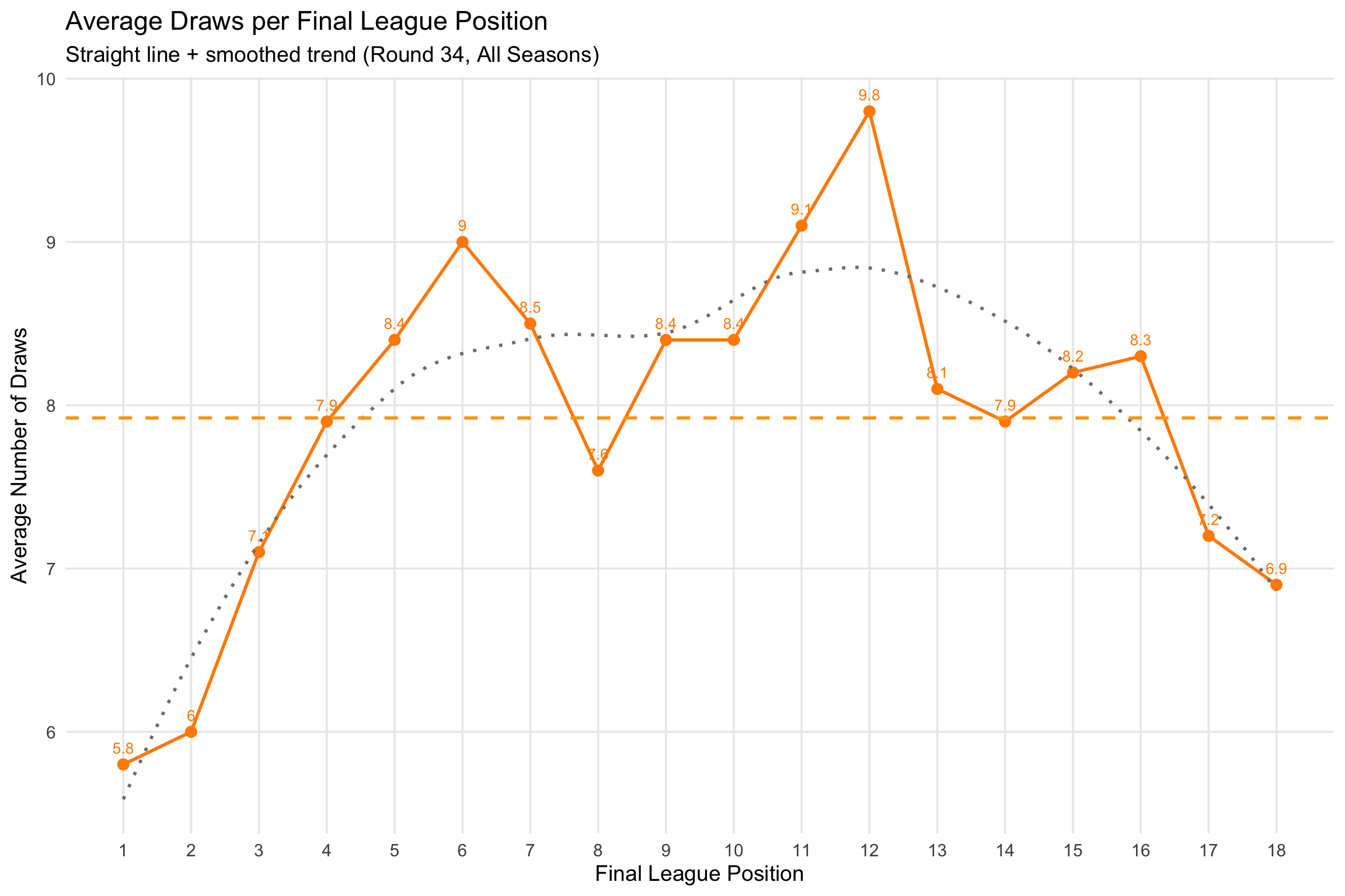
Promising stuff. I see the following as most interesting about these numbers:
lowest averages for top 3 and bottom 2 positions
position 12 looks special
- highest average, max and min
position 2 looks special
second smallest average
smallest range from 3 to 9
Somewhat normal distribution
highest density in the middle, lowest at both ends, but no real tail
could perhaps be chopped up into 3 groups: high, medium and low historical average number of draws
historically low avg = positions 1, 2, 3, 8, 17, 18
historically medium avg = positions 4, 5, 13, 14, 15, 16
historically high avg = positions 6, 7, 9, 10, 11, 12
Digging deeper with regressions
We’re starting to pick up on some interesting bits so in the next article I’ll be digging a bit deeper using regressions. This will also let me bring in the next topic: the effect of for and against goals on the chances of teams drawing.